Production analytics were the very first form of analytics to show up on WellDatabase back in 2014. Since that time, we have exponentially grown our production and other volume-based analytics. We'll cover how to use these valuable dashboards and the features inside. Let's jump in.
The volumetric dashboards include Production, Injection, & Disposition. These dashboards have unique features due to the time-series volume data involved. There are some differences between the three, but the basics are the same.
For the purposes of exploring the sections, we'll use the Production analytics.
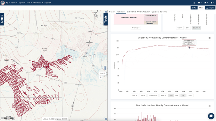
Quick note before we dive in. All analytics charts will interact with the map. All you have to do is hover over the charts and you'll see exactly how that works. For more information see the article How do charts, maps, and lists interact?
Group and Date Options
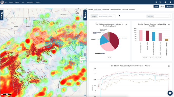
At the very top of the page, you can see there are two drop-downs. The first one is to select the group you wish to use for aggregation.
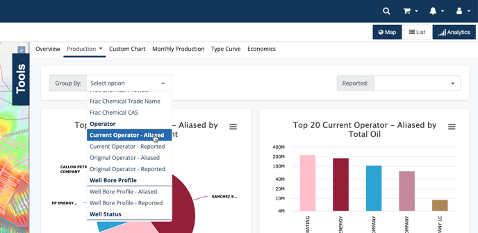
The group will alter all of your charts to be colored and aggregated by the value you select here. On this example, we have Current Operator - Aliased selected. There are numerous options in this list, like County, Well Type, Vintage, and more. Feel free to look through them all and test them out. The property you use will allow you to compare all wells in your search by that value.
The next field is a date filter you can apply just to the analytics page. In this instance, it is the Reported Production Date. If you set this value, it will further limit the values in your analytics page to only the date range selected.
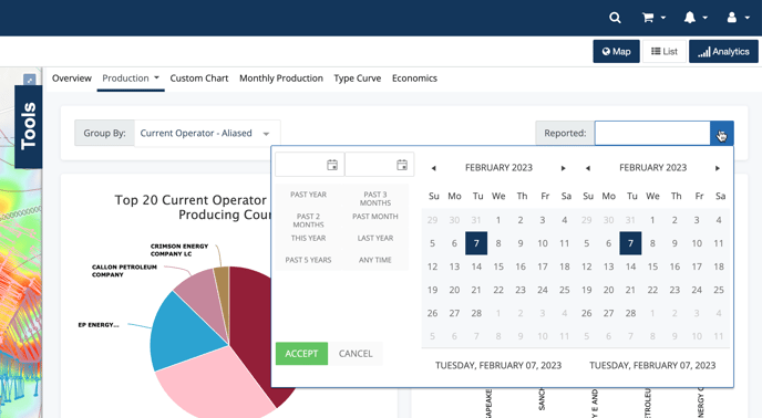
It is important to note that this filter only applies to the analytics dashboard you are viewing and does not affect your overall filters.
Basic Charts
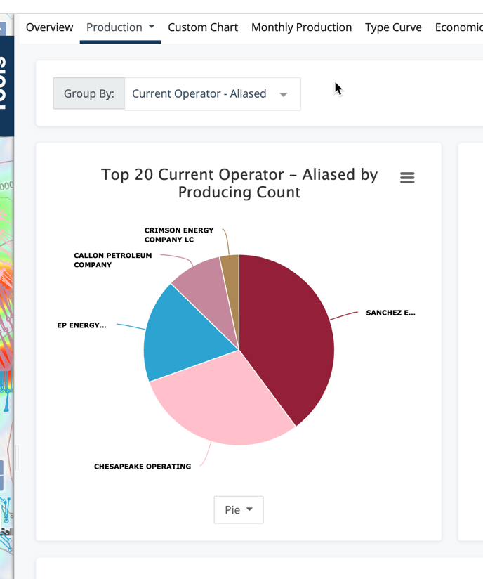
The next group of charts can be considered basic charts. The first of which is a well count chart. Since we're looking at production, the title here will read Top 20 Current Operator - Aliased by Producing Count. It's a mouthful for sure, but there are important details there. We do top 20 because more than that can be cumbersome. The group we've selected is Current Operator - Aliased and the count is based off of the number of producing wells. This last part is pretty important because it means that there may be additional wells in your search that are not counted. Given that we are looking at production analytics, the counts are limited to wells that have production.
There are additional visualization as well. To learn more all about these charts, see the article:
All about basic charts in dashboards
Time-Series Volume Chart
The volume charts are the cornerstone of all volumetric charts. While the various types of volumetric groups give you different options, the primary goal of visualizing volumes over time is consistent across them all.
For this article, we'll focus on the Production analytics. Below is the default chart which is showing total monthly production, grouped by Current Operator - Aliased.
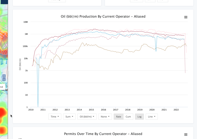
Just like the other charts, this chart will interact with the map and other charts on the dashboard. Additionally, hovering over a series will give you the production for that group on the date you hover over.
That's just the beginning though. The sheer number of options in this chart can be overwhelming. Fun fact, you can make 64,680 distinct charts here. Kinda crazy.
We'll just hit the high points here, but if you want to dive into more detail, see this article:
There are a lot of options in the production chart....what do they do?
Event Chart
Directly beneath the volume chart is the Event chart. This will give you a quick view of the relationship between the group and a handful of events.
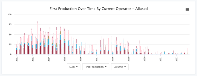
This chart is pretty straight-forward and allows you to quickly see things like wells coming online over time or the relationship between permits and production. The three buttons at the bottom allow for some simple customizations. To read more on those, check out this article - How do I customize an event chart?
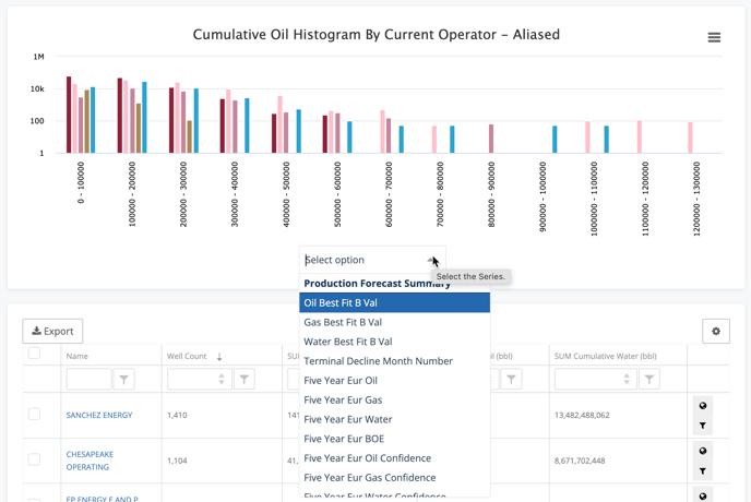
Histogram Chart
After the event chart, you have the Histogram chart. This chart has fewer options, but still remains extremely useful. The histogram chart will auto-generate bins of data to plot based on the property you choose. This allows you to spot outliers and understand the common values for whatever grouping you have selected.
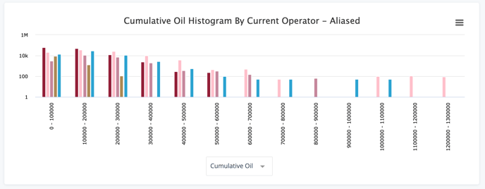 The histogram chart has over 340 options to select from. We have enabled a quick search to help you sift through them all. Once you click the dropdown, you can just start typing to find the property you need.
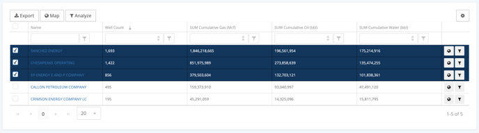
Data Grid
The last stop on our volumetric analytics is the Data Grid.
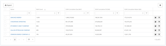
The data grid gives you a quick roll up of well counts and total production for each of your groups. In addition to Exporting the grid, you can use it to filter or do a deep dive into one of the individual groups.
To learn more about the analytic data grid, check out the following article
What can I do from the analytics data grid?
Conclusion
The WellDatabase volumetric analytics pages are your go-to for diving deep into production data, injection data, and more. There has never been an easier way to gain valuable insights into data.