The production chart in WellDatabase has been the cornerstone of our analytics since the beginning. The chart capabilities have grown exponentially, all from users requests. Here we'll take a deep dive into the production analytics and show you how to get the chart you want.
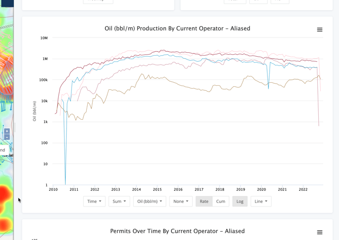
X-Axis Options
Moving left to right, the first option allows you to define your X-axis.
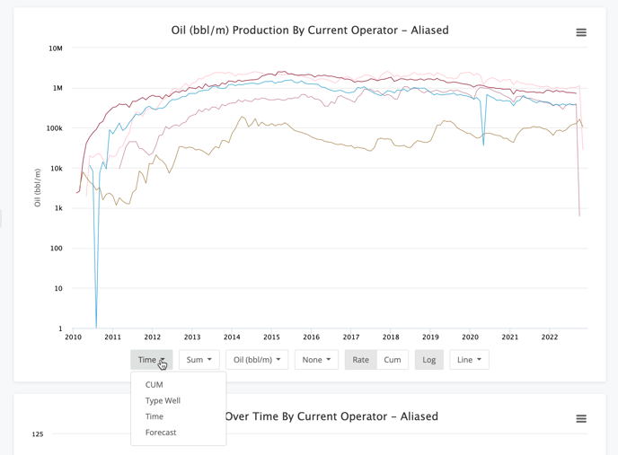
The options here are :
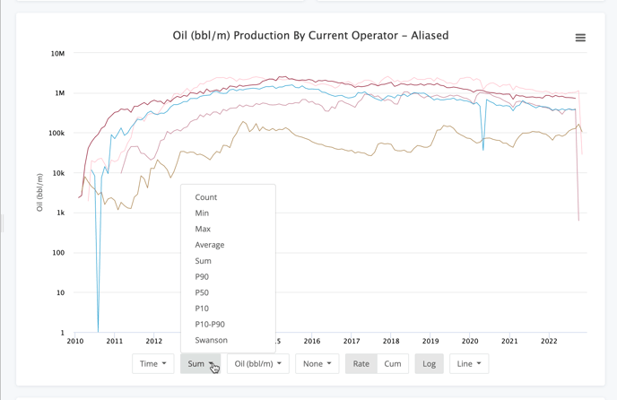
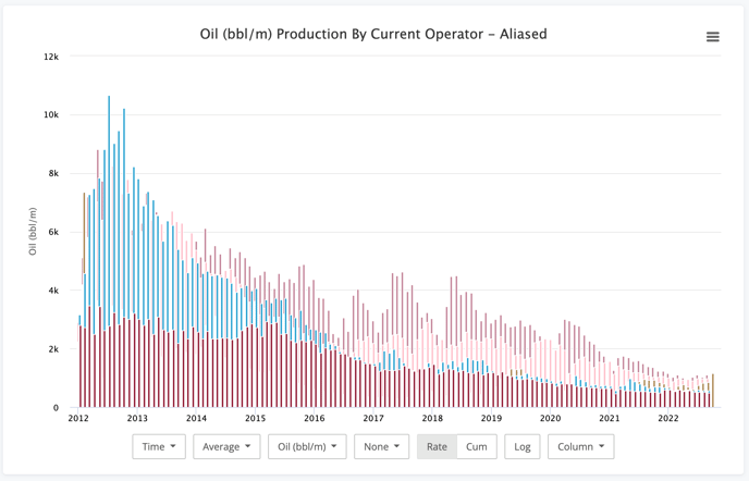
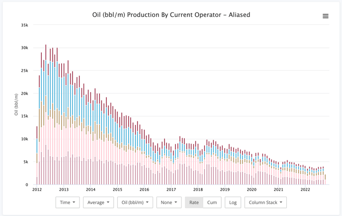
- Time - Total production, aggregated by the group you selected, over the time it was produced
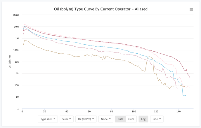
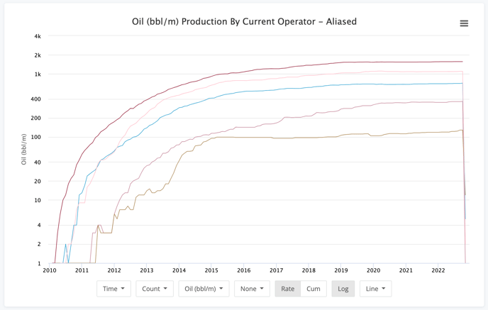
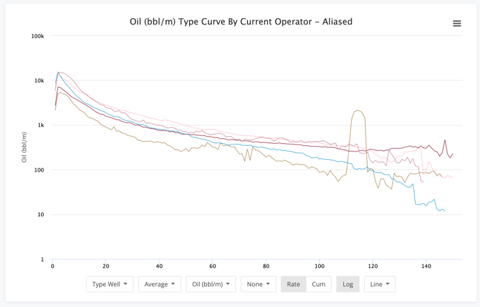
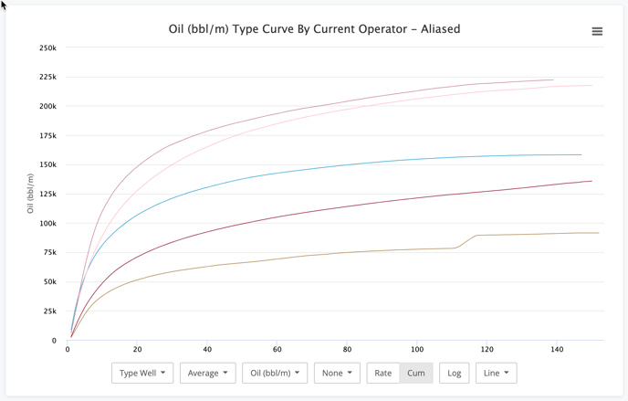
- Type Well - Production normalized by month number.
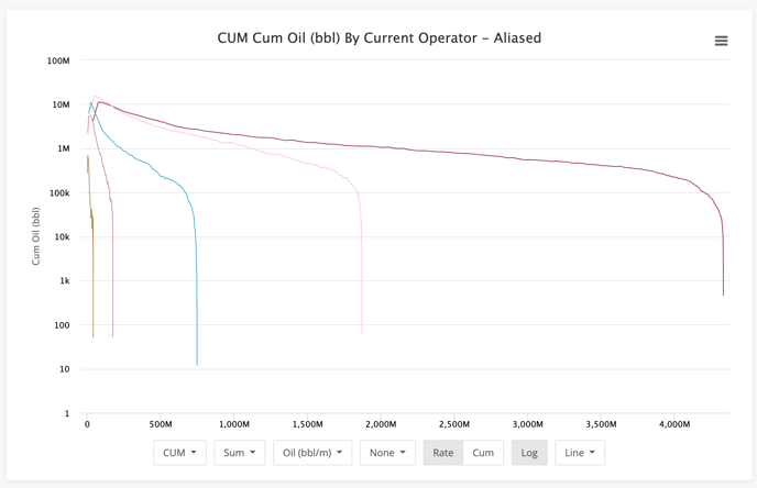
- CUM - Rate vs Cumulative production chart where the X-axis is the cumulative production
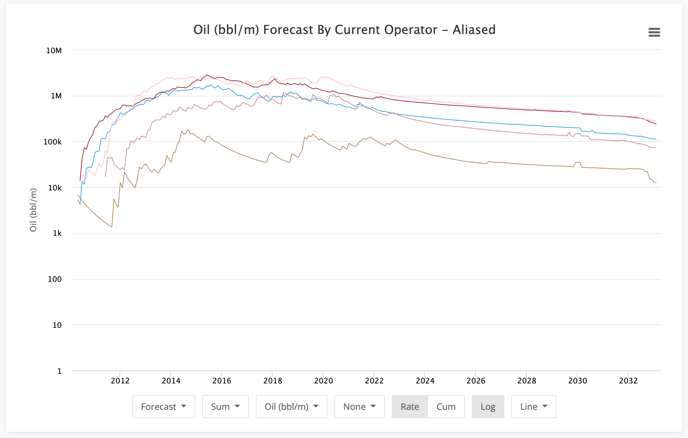
- Forecast - Existing production, like the Time option, but with our pre-computed production forecasts appended to the chart
One thing to note is that these chart options do not change the way the data is aggregated. That is very important to note for things like Type Well & CUM options. Luckily, that's the next set of options.
Aggregation Settings
Aggregating the production data can be done in many ways. If you're looking for an operators total production, then Sum would be the proper option. If you're looking for a type curve of the average well, then Average make sense. If you want to get more detailed on the percentiles, P10, P50, and P90 are perfect.
Here is a run-down on the options here:
- Count - Simple count of wells producing.
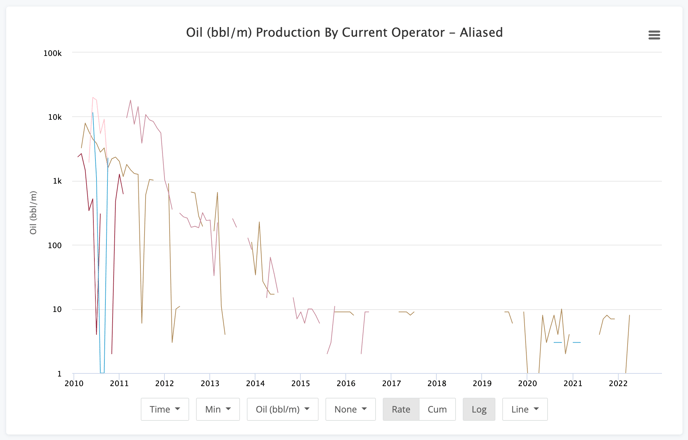
- Min - The minimum production value at each step. Note, this is not just the lowest producing well, but the lowest producer over each period dictated on the X-axis.
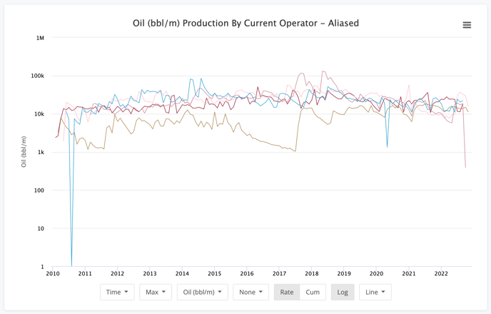
- Max - The max production value at each step. Same note applies as the Min option.
- Average - Average production for each period along the X-axis.
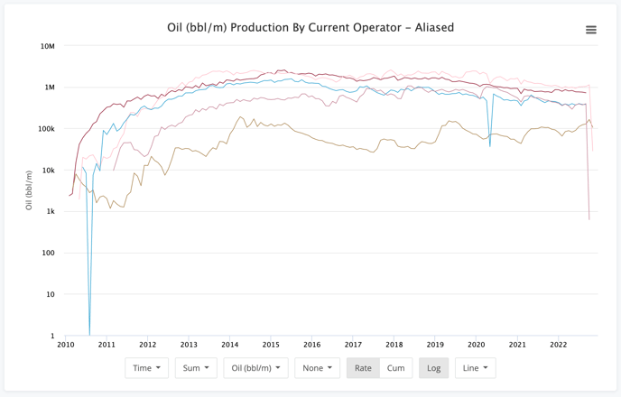
- Sum - Total values for each period. Especially useful on the Time option.
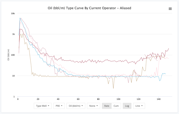
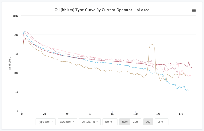
- P90 - Data here is in the 90th percentile. This means that the 90% of the wells in our group will be at or higher than the values in this chart.
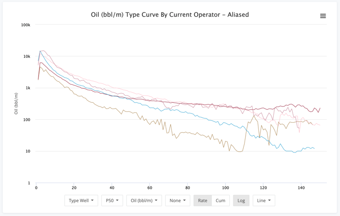
- P50 - The data in this chart is the median value for each period. While close to the average many times, it is different.
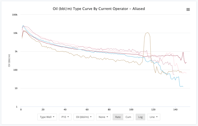
- P10 - Data here is in the 10th percentile. This means that it represents the top 10% of wells in this group.
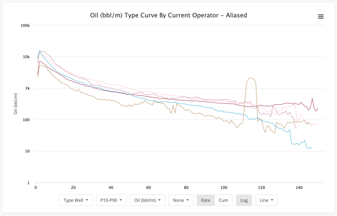
- P10-P90 - The P10-P90 option helps to show the variance between the top 10% and the bottom 10% for an operator. It naturally will be a higher value for periods of high production. This chart helps to show consistency with the wells in the group.
- Swanson - Sawnson is a weighted average of P10, P50, & P90. The formula used is P10*0.3 + P50*0.4 + P90*.03.
Volume Type
The next option is how you choose what volume you want to analyze. We won't show images of each of these since they tend to be pretty self explanatory.
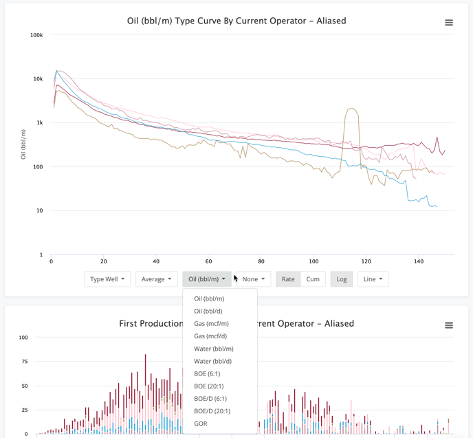
The options here are :
- Oil (bbl/m) - Monthly oil production (this is how it is reported to all regulatory agencies)
- Oil (bbl/d) - Daily oil volumes calculated by simple division of monthly production and days in the month.
- Gas (mcf/m) - Monthly gas production
- Gas (mcf/d) - Calculated daily gas volumes
- Water (bbl/m) - Monthly water production
- Water (bbl/d) - Calculated daily water volumes
- BOE (6:1) - Monthly BOE volumes using the standard energy ratio of 6:1 - mcf Gas : bbl Oil
- BOE (20:1) - Monthly BOE volumes using a financial ratio of 20:1 - mcf Gas : bbl Oil
- BOE/D (6:1) - Daily BOE volumes using the 6:1 ratio
- BOE/D (20:1) - Daily BOE volumes using the 20:1 ratio
- GOR - Gas oil ratio values for each period
Normalization Options
In the world of unconventional plays, normalization of production numbers has become a requirement. With varying amounts laterals, proppants, and more, normalization helps you create a better apples to apples comparison.
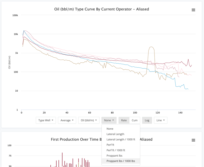
Each of these options does the same simple division. It is production volume divided by the option you select. The options are :
- None
- Lateral Length
- Lateral Length / 1000 ft
- Perf ft
- Perf ft / 1000 ft
- Proppant lbs
- Proppant Lbs / 1000 lbs
Rate vs Cum Option
A very basic option that can be applied to any chart you have built is plotting the rate vs the cumulative. This can be very useful when you're comparing things like type curves.
Rate - This option shows the value you selected as-is. This means that the combination below, Type Well showing Average Oil (bbl/m), shows the values per period.
CUM - The CUM (or cumulative) option will show you the values using a running sum. Each period's value is added to the previous to roll up to the cumulative number.
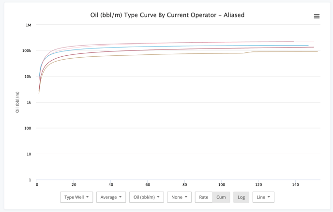
Type curves naturally have many dynamics at play. Initial production numbers, initial decline numbers, the b-value of the decline, and more. This chart can be more helpful to see what the net effect of everything together ends up being.
This also makes a great segue to the next option, the Log button.
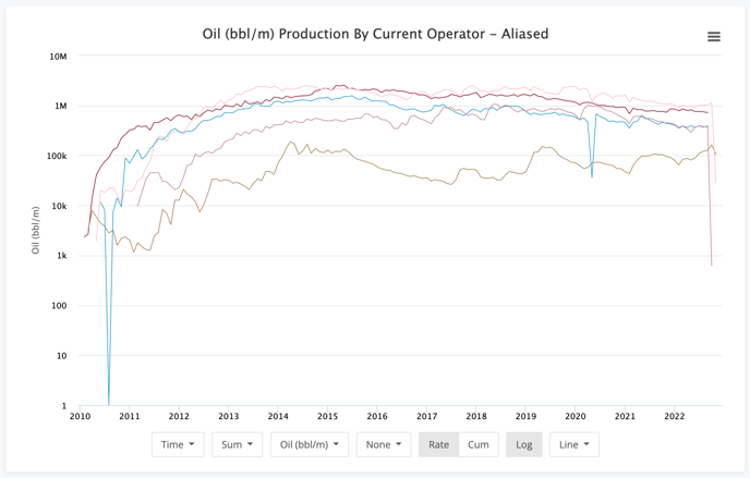
Log Scale
Production data is usually viewed on a log scale. The decline from the initial months to the tail is just too drastic to be able to view it on a numeric (non logarithmic) scale. However, in the case above using the Cum option on a type curve, the data gets too muddy to discern what is happening. This is where the turning off the Log scale can help.
Now we can more clearly see where the production profiles diverge from each other and glean additional insights.
Chart Type
Finally we get to the last set of options and that is the chart type. By default (and in every sample here), we use the line chart. The data just lends itself nicely to it. However, the other options do have their roles. Let's see what they look like.
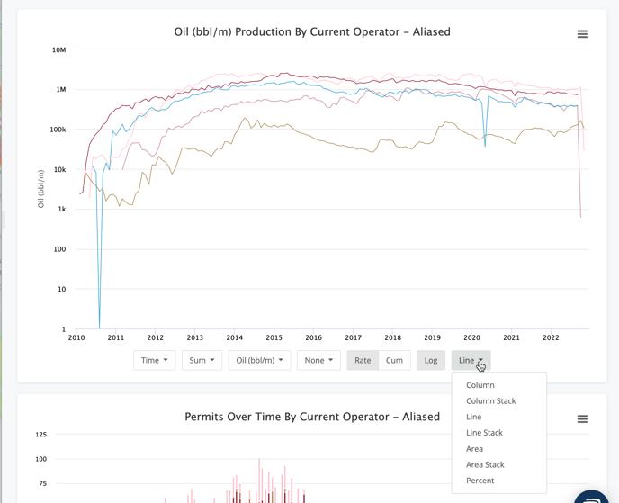
- Column - Can be useful to better compare specific data points. Can also get very messy with too much data.
- Column Stack - Great for visualizing the total dataset while being able to easily break out which groups account for what piece of the total production.
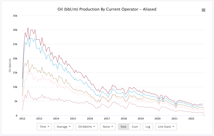
- Line - Very useful just about everywhere and the default for a reason.
- Line Stack - Back to comparing the individual groups vs the whole.
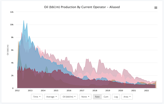
- Area - Somewhat like the column chart. Area has some level of transparency so you can still see the data series underneath others.
- Area Stack - Another good one for viewing trends within the whole.
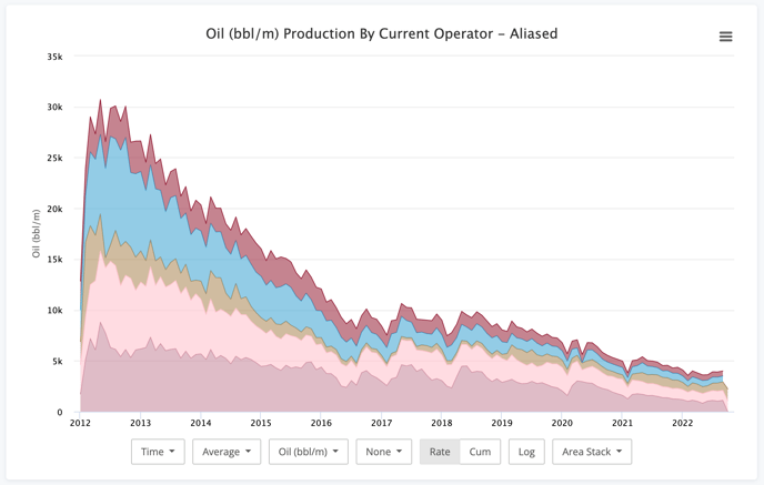
This one is pretty popular with the vintage look.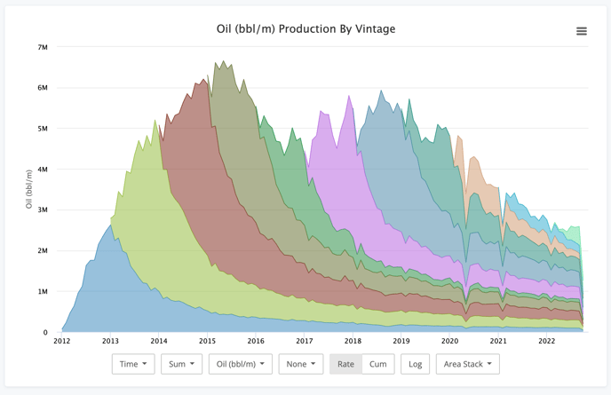
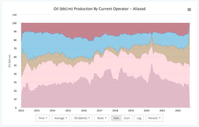
- Percent - Perfect for answering the specific question of exactly what percent of the whole does a group account for.
Conclusion
So six years later, we're done. Congrats if you made it this far. As you can see, the production charts can do a little bit of everything. Hopefully it helps you make the exact visualization you need.