With so much data and different visualizations, data can seem overwhelming. WellDatabase analytic pages aim to simplify some of the struggles with visualizing the data. One of the ways we do that is to make a few charts standard across all analytic dashboards. Here we will go over those and what they do.
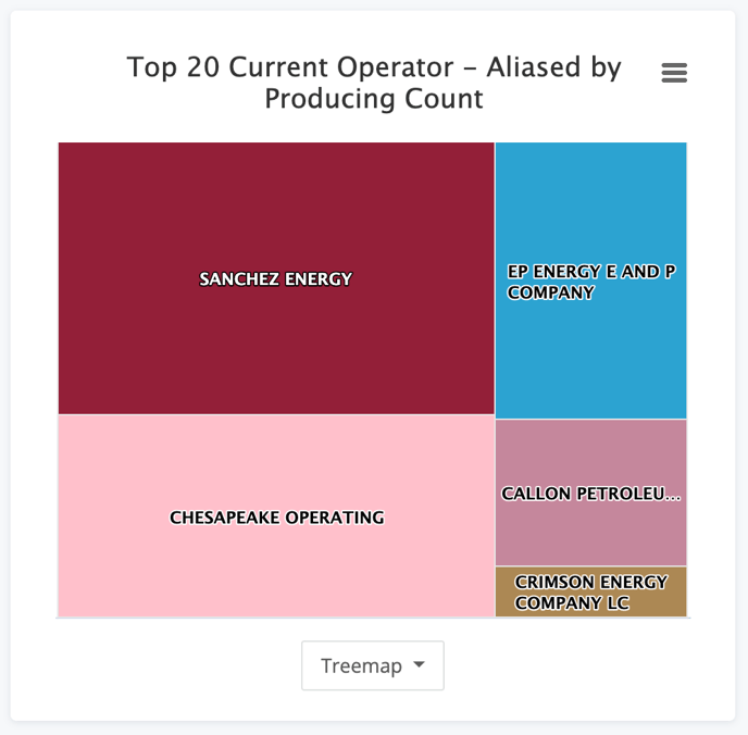
Well Counts
No matter what you're looking at or how you are slicing it, the distribution of wells is a key metric. That is why the chart below can be found on every analytic page.
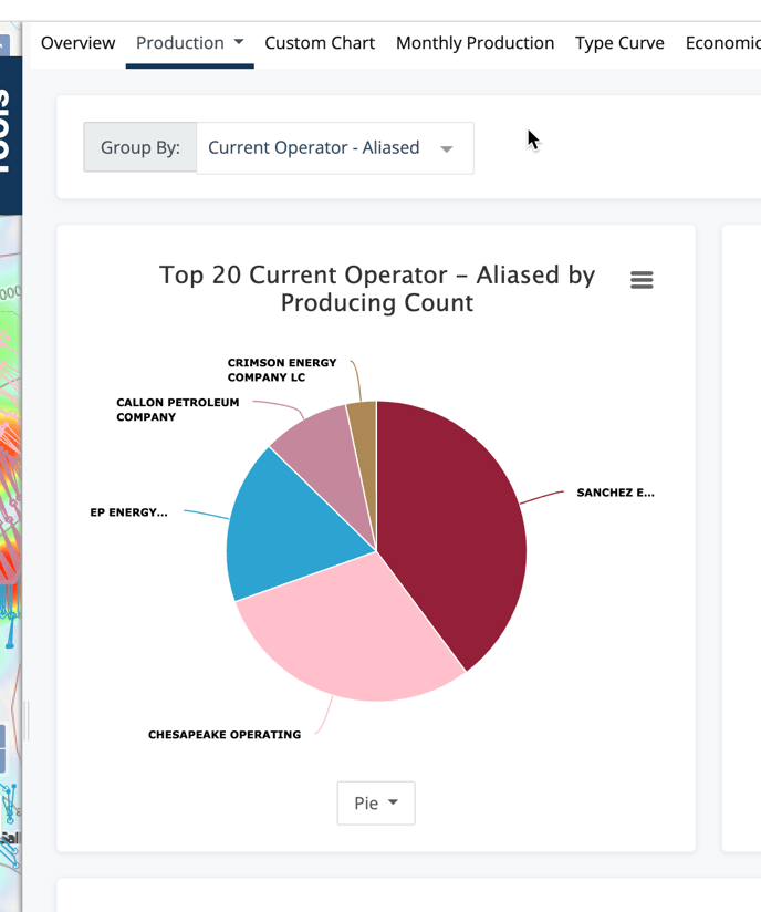
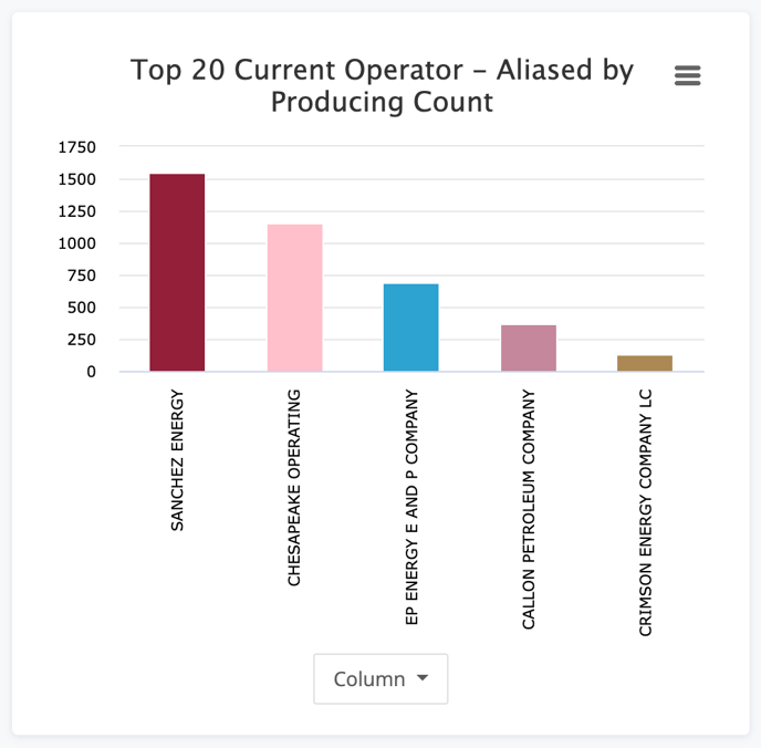
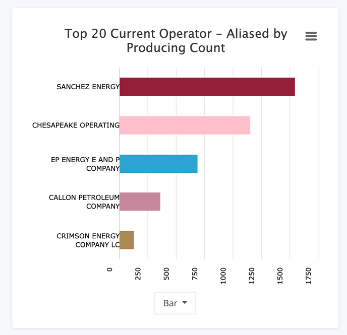
There are additional visualization as well. You can select any of the options from the drop down.
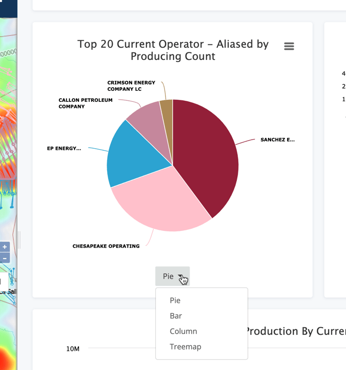
Here are quick samples of what each type looks like:
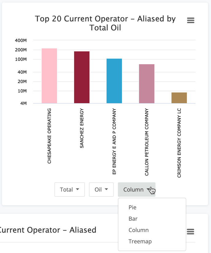
Numeric Aggregate Chart
The next chart has a little more detail and a few extra options. This chart gives a high level sum, average, min, or max of the value you select.
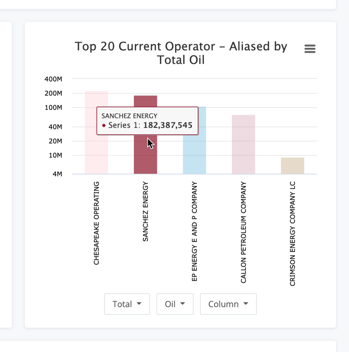
To toggle your current view, choose any of the drop-downs at the bottom.
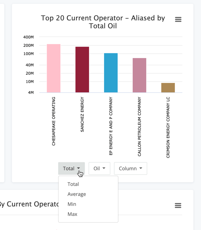
Aggregate values available are Total (sum), Average, Min, and Max.
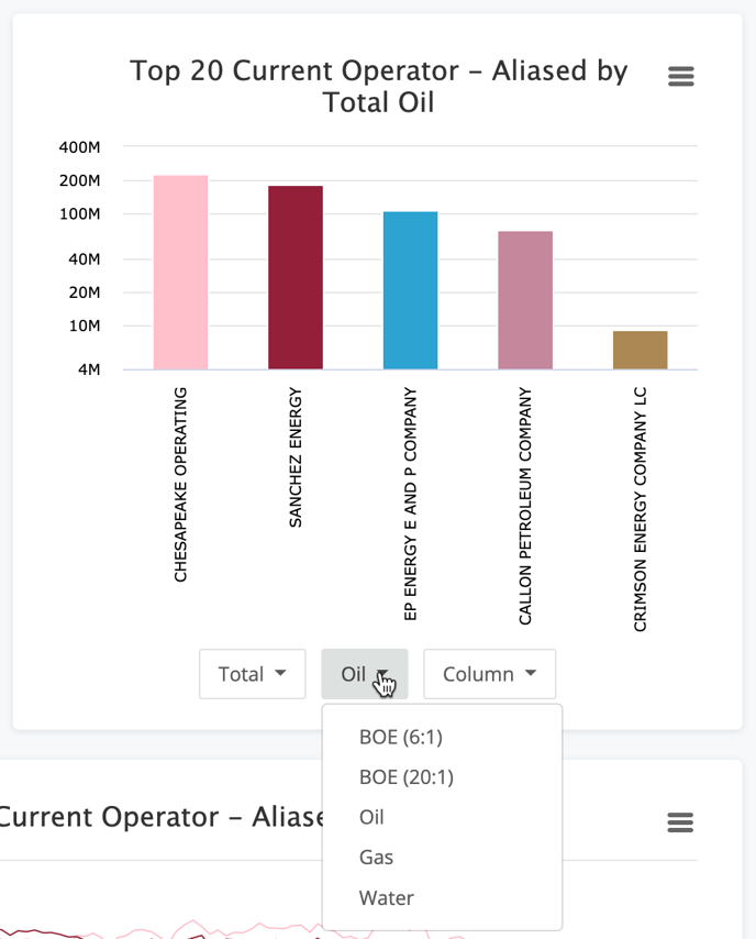
The property used in the chart can be changed as well. The options in the list will vary based upon the dashboard you are working with. Below is an example of the options for the Production dashboard.
Last option available is the visualization style. Default is set to Column, but you can select from the same options as the count chart above.
Conclusion
These basic charts are a great overview of the data. The consistency of having these charts in all of your analytic dashboards also helps simplify your analysis.