It may not be completely obvious, but interactions between charts, maps, and other well data can help solidify your understanding of the data. Knowing an operator has more wells or more production is certainly useful. It is enhanced when you can see just how those wells are organized within a geographical interface like a map. Data interaction is a key component to WellDatabase and we will explore that here.
Analytics
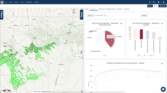
Every chart on the primary dashboards will interact with both the map and the other charts. This means when you hover over an operator in our chart, it will highlight that operator's info everywhere.
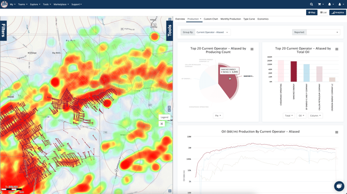
It is important to note that the interaction will happen regardless of how you have your map configured or how you have your analytics grouped. For example, below we have the analytics grouped by Current Operator and the map grouped by Well Type.
Lists
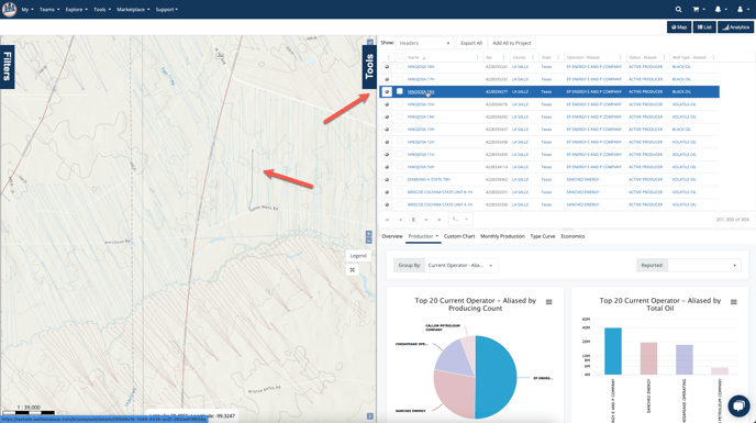
In addition to the interaction in the analytics, the List will also interact with the map to show you individual well locations.
Conclusion
While interaction may seem like a small thing, it really adds another dimension to the data. With so much data to interpret, all additional insights are welcome. Hopefully this feature in WellDatabase will help you with your insights.