The data grid in the analytics is easy to overlook, but it contains quite a bit of functionality. There are actually two variations of the data grid in the analytics. One is used for volumetric dashboards (production, injection, & disposition) and the other is used for event dashboards (permits, completions, stimulations, etc). We'll go over both of them here and explore the options available.
To learn more about the different types of analytics, see the following articles:
What is displayed on the volumetric analytic pages?
What is displayed on the event analytic pages?
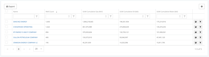
Volumetric Data Grid
The volumetric data grid contains well counts and cumulative production numbers by default.
Customize Columns
You can customize the columns in this grid by clicking the gear icon in the right corner.
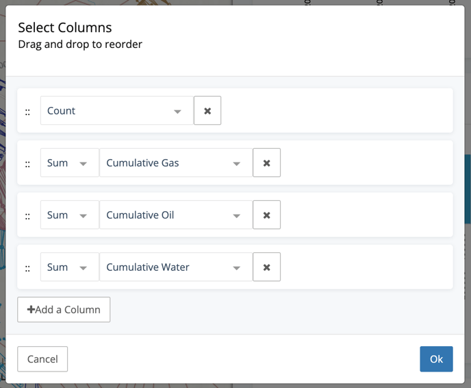
As you can see, you can change both the aggregation type and columns. Adding additional columns is as easy as clicking the Add a Column button. It's also easy to drag and drop the columns to change the order.
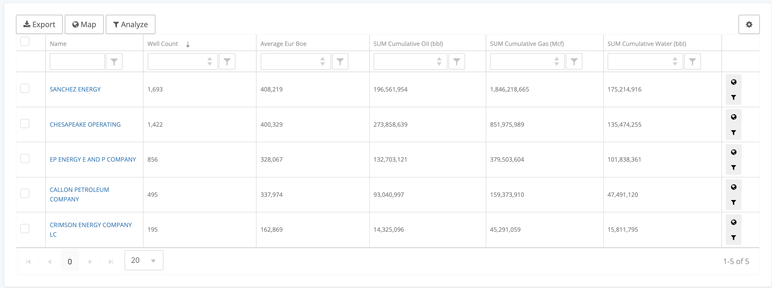
Here's a view of a grid where we've changed the order and added the Average EUR BOE column.
Export
The Export button at the top of the grid will quickly give you a .csv download that can easily be opened using Excel or any text reader.
Filter
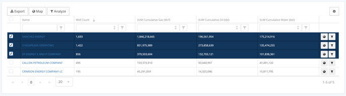
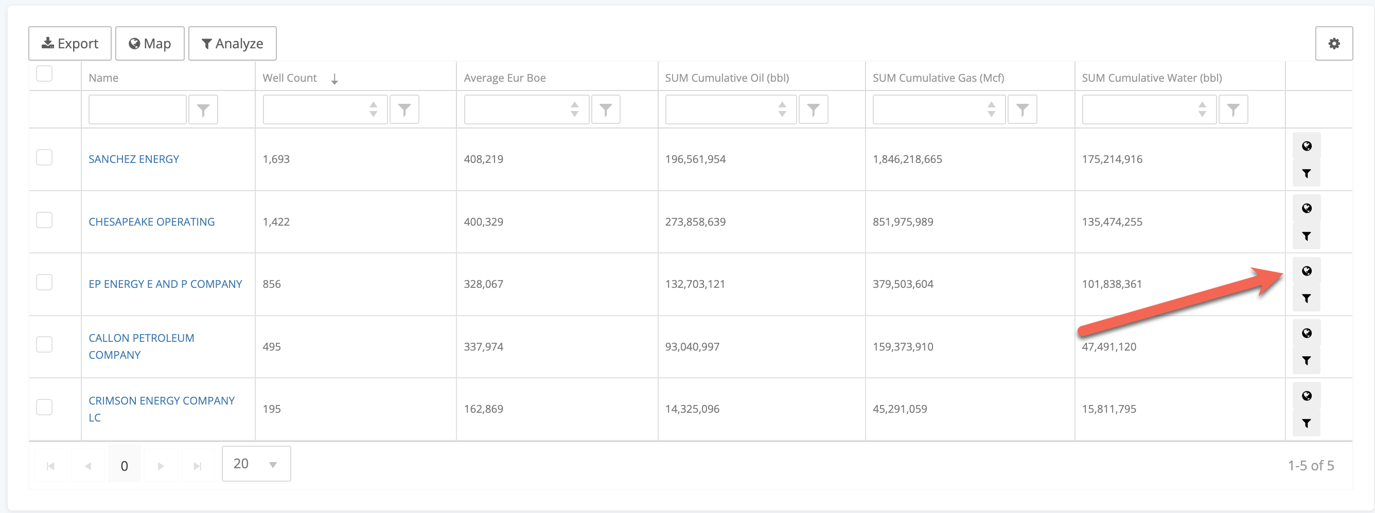
One of the best features of the grid is the ability to select multiple groups and filter the dataset to those groups. One of the most popular uses is to sort the grid by well count, select the top 5 groups (operators for example) and click Map to filter.
Additionally, if there is a single value that you want to add to your filters, all you have to do is click the filter button on the right side of the row.
Analyze
There are times when you find yourself using the analytics, and you want to quickly isolate a single group (like an operator) and view the details of just their data. The analytics allows you to do just that. On each row, you can click the Analyze button to look at just that group.
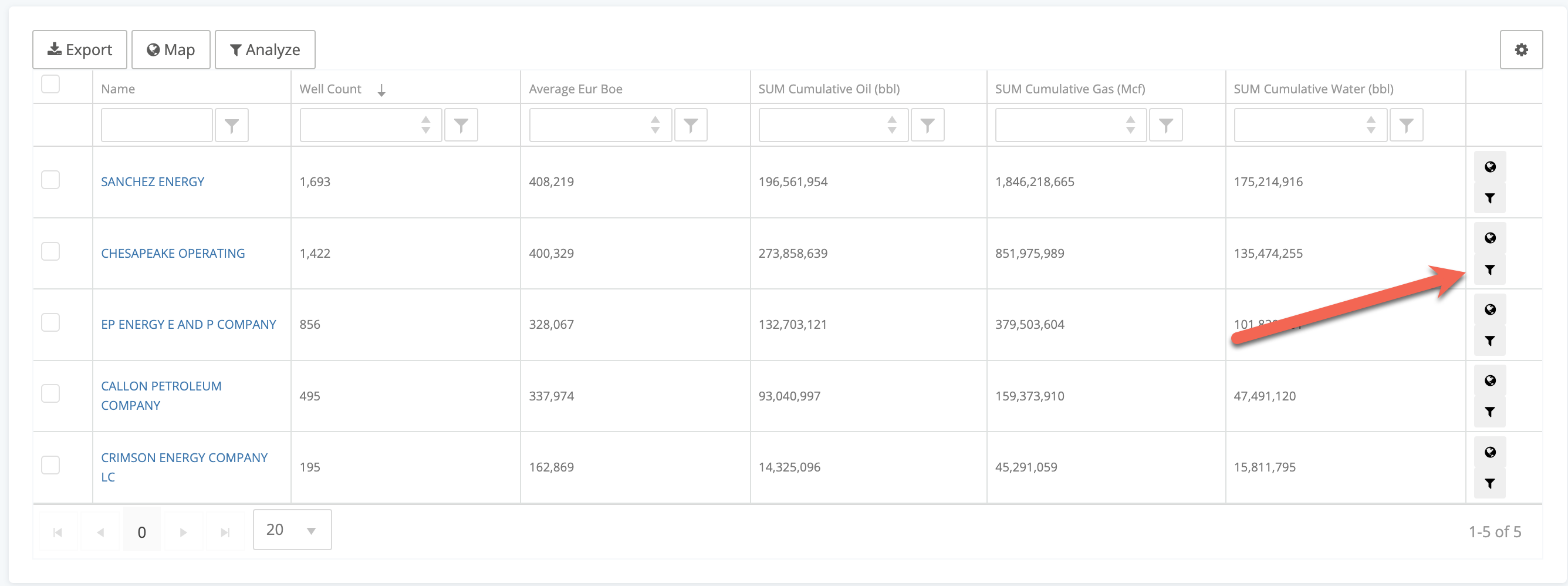
Just like the filtering above, you can select multiple and click the Analyze button at the top. This will give you an analytics page dedicated to whichever groups you select.
Pivot Data Grid
This pivot grid is used primarily on our event dashboards and in our custom dashboards. This grid is a little simpler, but still gets you some very quick insights.
Here we have an example from the Permit Analytics page. It is breaking down Permit Count by Operator by Primary Formation.
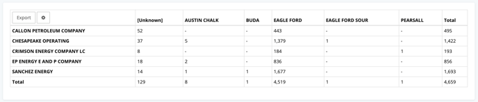
Just that one pivot can help you understand the formations being targeted by companies. The row value is based on the grouping you've selected for your Analytics page. The columns are customizable by clicking the gear button on the top left.
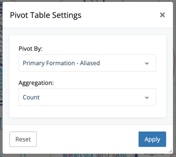
The choices to Pivot by will always include our standard grouping properties, as well as additional properties specific to the analytic section you're in.
Conclusion
The data grids in the analytics are another example of how WellDatabase makes it simple for you to surface insights quickly and easily. Digging deeper just opens more functionality so you can always dig deeper.