Well Spots
Well spots are the most common way that users visualize well locations on the map. To learn more on customizing what is visible, see the following articles:
Colorized Groups
Colorized groups allow you to choose particular properties to color, shape, and size by. To learn more about these options, see the Group Settings document.
Examples using colorized groups:
Bottom hole colored by well type

Bottom hole and lateral colored by well type

Surface, bottom, and lateral colored by well type

Well Symbols
The Well Symbols option gives you the standard well icons you might see in other systems. Things like a green dot for oil or a red gear for gas. The icons will only appear on the bottom hole, but you can still customize the view.
For quick reference all of the well symbols are viewable in the map legend, when selected.

Examples using the well symbols:
Show bottom hole only.
Bottom hole and lateral with the lateral colored by well type.
Bottom hole, lateral, and surface. Both lateral and surface are colored by the well type.
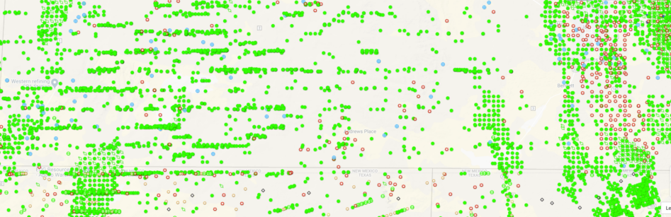
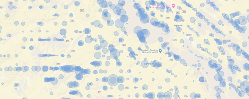
Bubble Map
Bubble maps are a great way to get a view of the variance of values over your search area. While you do get a very similar view on the Colorized Groups using the Size By property, the bubble map creates a prettier picture.
The bubbles are placed on the bottom hole location. The bubble settings are pretty straightforward
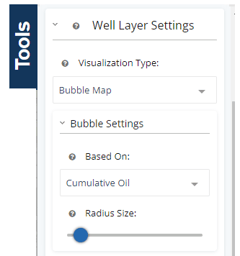
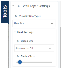
The Based On field is simply a choice of what property you’d like to use to create the map. The Radius Size is a base size of the circle used for the smallest value of the property your bubble map is based upon.
Example using bubble map:
Cumulative oil
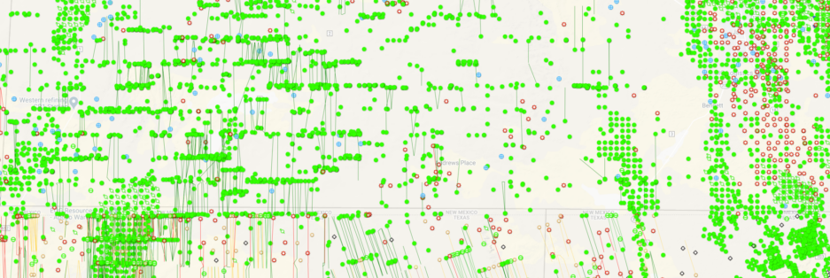
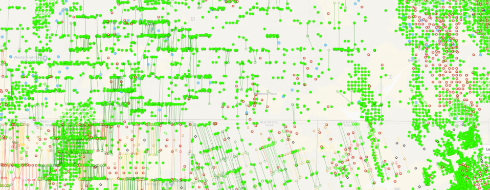
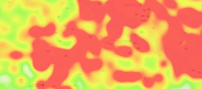
Heat Map
The heat map is very similar to the bubble map in many ways. You have the same settings, but the radius size allows you to blend spots together as it increases.
Examples using heat maps:
Below we have two heat maps using the same property, just with different radius sizes. The first separates out the well values where they are more distinctive.
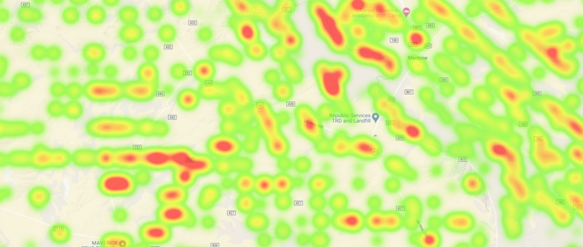
By raising the radius, we allow the larger values to bleed into each other and create a wider trend in our map area.
Choropleth Maps
Choropleth maps can easily highlight the highest and lowest producing areas in the map search based on county, state or basin.

Example using choropleth map:
For this example, we have targeted cum oil by county in Oklahoma. In your tools bar, change start by changing your visualization type to Choropleth Map, then adjust the settings.
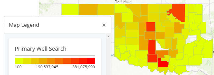
Use this same method to quickly identify permits over time, EUR, or any other data point that you are looking to compare a high/low in a quick visual representation.
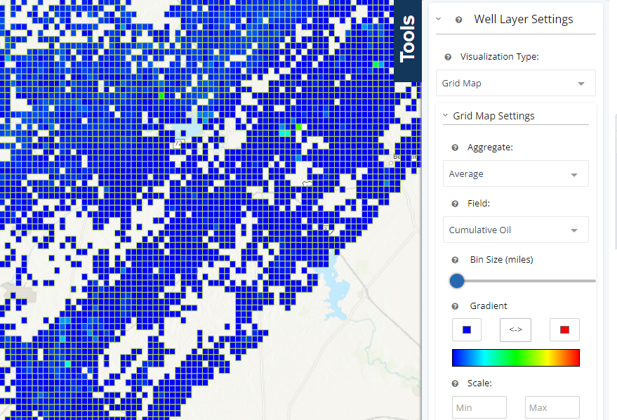
Grid Map
Similar to choropleth maps, but on a much smaller scale, grid maps will highlight higher results based on the field you are searching for.
Example using grip map:
This map is showing grids in one mile sections.
With all of the map options in WellDatabase, there is next to nothing you can’t do.