Decline curves are notoriously subjective. WellDatabase helps you by creating mathematically correct decline curves, but sometimes you need to compare multiple curves. Multiple declines can be created on any of our production charts.
Tip: Here are a few additional resources as you get started in Decline Curve Analysis.
Additional Articles: Decline Curve Settings, Creating a Decline Curve, Aggregate Production Decline Curve
Video: Decline Curve Analysis Webinar
Blog Posts: When the Best Fit Doesn't Fit, Using DCA to Compare Operators
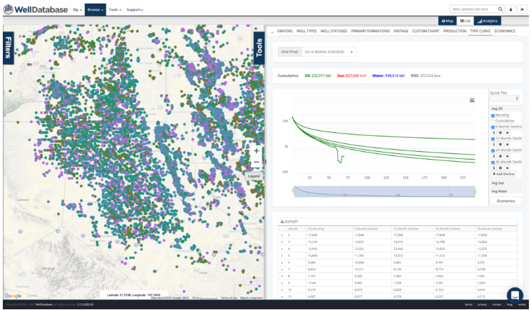
For the purposes of this document, we’ll be working on the aggregate type curve.
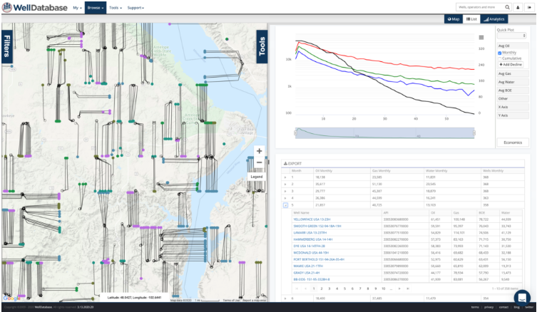
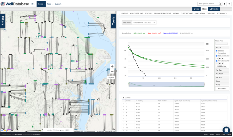
Below is the image of the map and standard type curve for our search. This is the same search we used in the intro to Type Curve DCA. To learn more about the initial decline setup,
After creating our curve, we zoom into an area of production to see how close the decline fits the actual production. This is a mathematical fit, so it is accurate. The biggest variable in creating that fit is the range of data used. When we zoom in, we see that the fit is several thousand barrels off at month 16.
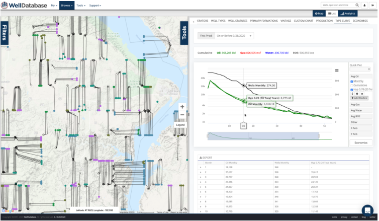
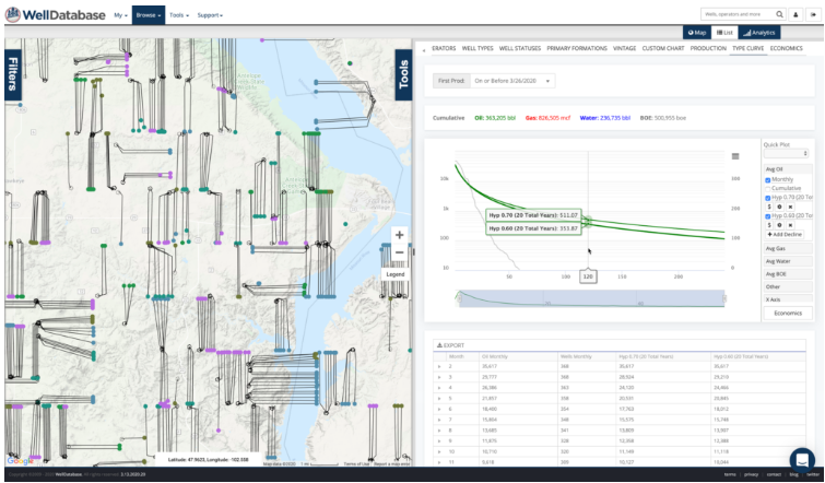
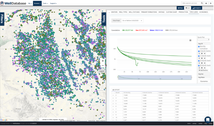
A visual inspection gives us a clue to the bump that raised the fit a little higher than we might like. If we zoom into an area that looks to be more indicative of the stable decline, we can generate a second decline from that range.
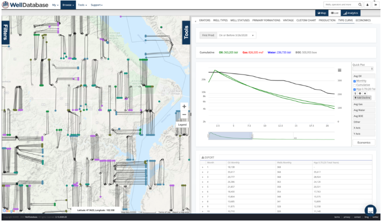
Now with the second decline, we can see how they diverge over time.
Hovering over the forecast, we can see just how different the declines look. Here we see a difference of close to 160 bbls on month 120. The difference may be insignificant based on your particular economics, but creating multiple declines gives you the information you need to make that decision.
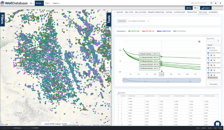
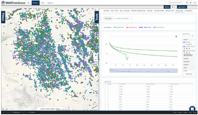
For another quick example, we’ll jump over to the Permian and create a series of declines based on varying ranges of data. We’ll name our decline curves to make it easier to visualize.
Using 6 months production:

Adding a decline curve for 12 months production:
Adding another decline curve for 24 months production:
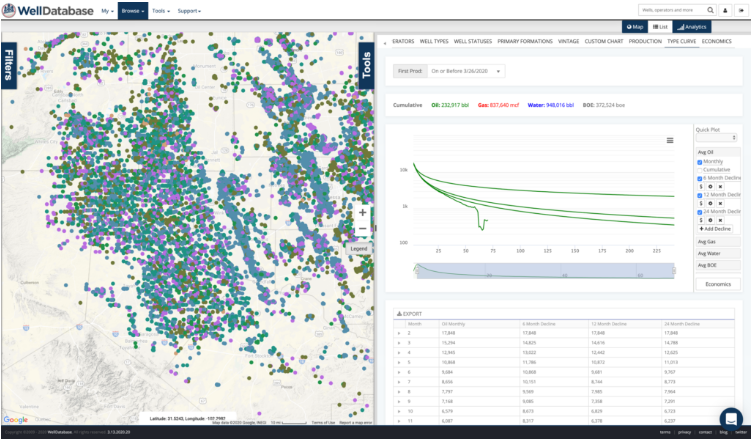
Another for 36 months:
Lastly one for 48 months:
Now with a quick mouse-over, you can see the values for each scenario. As you can see, the difference in using 6 months of production vs even 12 months of production is nearly 2,000 barrels at month 120. This visualization gives you the power to understand how much data is truly needed to make an evaluation.