WellDatabase contains many different types of data. Analytics aren't a one-size-fits-all solution, so we have dedicated analytics pages for these events. Here we'll run down what is included in those pages and how you can use them to gain better insights into activity of all kinds.
There are actually two types of event pages. The first type is related specifically to Rigs and Permits. These types have limited numerical data to aggregate, so they're geared towards counts and dates. The second type is around Completions, Stimulations, & Tests. These items have additional numerical data that can be aggregated on their pages. We'll be sure to show the similarities and differences below.
If you're looking for production analytics, check out this article.
Group and Date Options
At the very top of the page, you can see there are two drop-downs. The first one is to select the group you wish to use for aggregation.
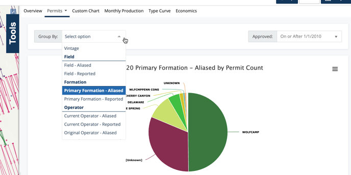
The group will alter all of your charts to be colored and aggregated by the value you select here. On this example, we have Primary Formation - Aliased selected. There are numerous options in this list, like County, Well Type, Vintage, and more. Feel free to look through them all and test them out. The property you use will allow you to compare all wells in your search by that value.
The next field is a date filter you can apply just to the analytics page. In this instance, it is the Permit Approved Date. If you set this value, it will further limit the values in your analytics page to only the date range selected.
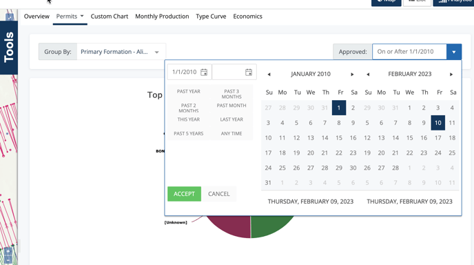
It is important to note that this filter only applies to the analytics dashboard you are viewing and does not affect your overall filters.
Basic Charts
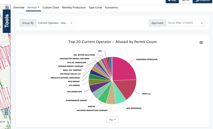
The next group of charts can be considered basic charts. The first of which is a well count chart. The Permit & Rig analytic pages will only have the well count chart. The Completions, Stimulations, & Tests analytic pages will have the additional volume chart.
Since we're looking at permits, the title here will read Top 20 Current Operator - Aliased by Permit Count. It's a mouthful for sure, but there are important details there. We do top 20 because more than that can be cumbersome. The group we've selected is Current Operator - Aliased and the count is based off of the number of permits filed. This last part is pretty important because it means that the number of wells in your search may not match the number of permits filed. This is easily explained by the fact that there are multiple types of permits and some wells will have multiple permitted actions over time.
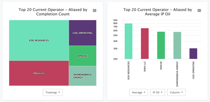
The additional charts in the Completions, Stimulations, & Tests allow for some additional insight. Here's a quick example from the Completions analytics page. We get the Completions Count by Operator, as well as the Average IP Oil by Operator.
There are additional visualization as well. To learn more all about these charts, see the article:
All about basic charts in dashboards
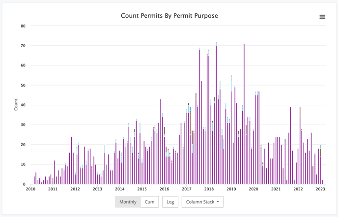
Time Series Chart
The time series chart is the next chart in the list. The options again are similar but different between the Rig & Permit analytic pages vs the Completions, Stimulations, & Tests analytic pages. First we'll look at the Permits.
This chart is a great indicator of activity, much like the activity chart in the volumetric analytic pages. It is a simple and clear view, something we all can appreciate.
Given the additional data points included in Completions, Stimulations, & Tests, we can create some additional charts to help identify trends.
The first example is the Average IP Oil by Current Operator over time. We can see a broad trend towards higher IPs here.
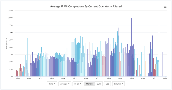
This is a great example of an answer that begs the next question, why? Well, to solve that, we can flip over to the Stimulations and, using the same chart, look at the Average Proppant Usage by Operator. While it's not an exact match, the trends have some similarities.
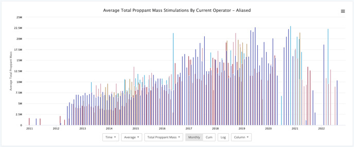
This may not be the only driver of increased production, but it certainly is one piece of the puzzle. There are dozens of other factors that you can plot here as well.
Pivot Table
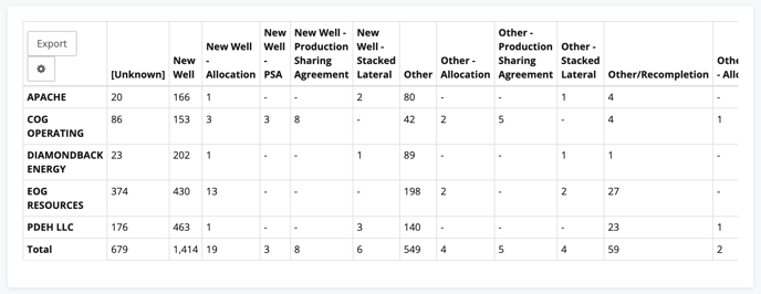
The last section we have is our Pivot Table. This table is pretty straight-forward. Your working group will be your row and you can select the pivot value. Below we have the Current Operator pivoted by County.
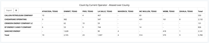
At this time, the values in the pivot chart are limited to counts. However, there are numerous values you can use to pivot. Like below where we've pivoted Current Operator by Completion Purpose.
Conclusion
The event based dashboards in WellDatabase provide valuable insights into a variety of data types. Dive in today and see what you can find.