Production data is available in WellDatabase in many formats. The time series chart here is specific to the Well Details and the Aggregate Production chart. There are a number of options on these charts alone, so we’ll run down what you can do.
Monthly Production Chart
The main monthly production chart is located in analytics. This tab will present you with results from all of the wells currently in your map view.
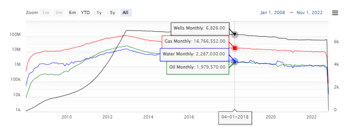
![]()
By default, the chart will show oil, gas, and water production data. If a well count is relevant, it will appear by default as well. There are a number of other series you can hide/show in addition to these.
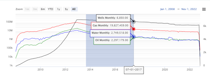
At the top of the chart, you'll see a quick list of all cumulative production numbers.

Monthly production gives you a month-by-month chart of production numbers. If this is in the analytics section, it is a total of all production in your search. If it is on the well level, then it will just be the production for that well. Below is the monthly production data for a set of wells, with the well count series included.
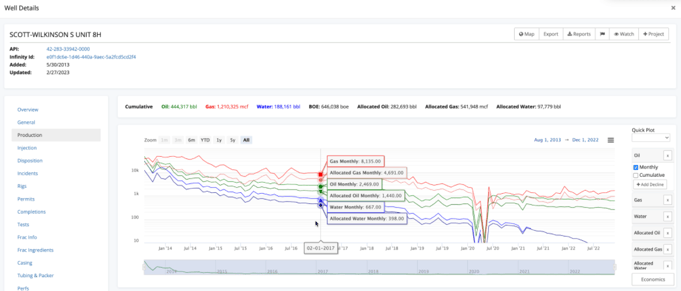
Single-Well Monthly Production
Monthly production reports can also be accessed through the Well Detail page, on the production tab for a single well.
Additional Charting Options
Whether you are using the monthly production chart in analytics for multiple wells, or well details production chart for a single well - the options below will apply to both.
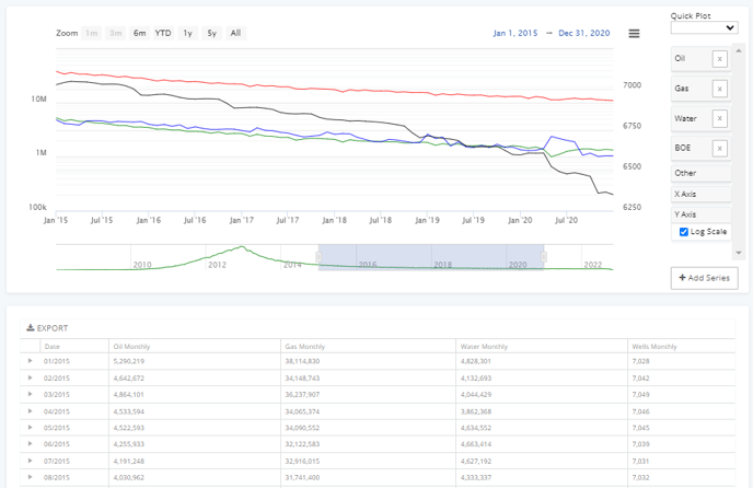
There are a number of options on the right hand side that allow you to customize the chart. The Quick Plot drop-down at the top gives you a handful of predefined views you can toggle instantly.
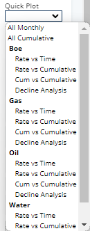
All production series have the option to view the monthly values, show cumulative values, or create a decline. Any series that has the + Add Decline button can have one or more declines created based on that series.

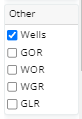
In addition to standard production outputs, you can also toggle auxiliary outputs like GOR, WOR, WGR, & GLR.
Lastly, you can toggle log scale on and off for the Y Axis.

Date Ranges
There are multiple ways to zoom in to a particular region of the chart:
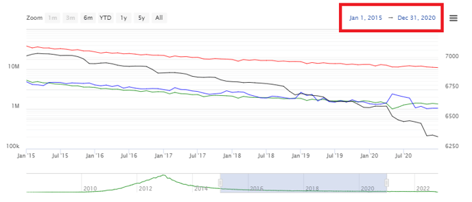
1. You can utilize the preview chart beneath the primary chart and use the slider to narrow the date range. The blue highlighted dates are what will appear in the chart.
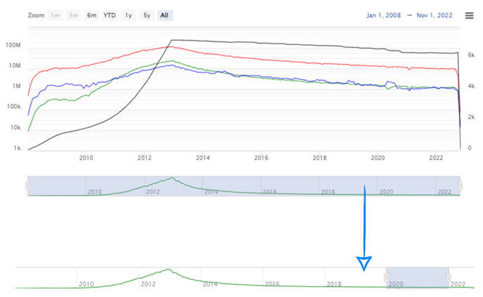
2. You can click and drag on the primary chart to zoom to a date range.
3. If there is a specific date value, simply use the dates at the top of the chart.
Zooming the chart will also filter the table beneath the chart. This helps you understand aggregate values (cumulative, min, max) for a specific time period. Perfect if you are looking for total production over a period of time.
Conclusion
Production data is one of the most critical pieces of data available in WellDatabase. The charting tools really allow you to dive in and understand the data. Production numbers are one of the more reliable numbers used to compare wells, operators, and more. WellDatabase gives you the power to decide the best way to compare these values.