While you can turn your entire map into a heat map by changing the well spots to a heat map (here's how to article) this method is useful in identifying broad trends. By maintaining the well spots on the map gives you additional options in seeing your data differently.
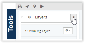
This can be easily created by using a data layer. We will maintain our well spots, and use the heat map as a layer. Start by navigating to the tools panels and selecting the + next to Layers.
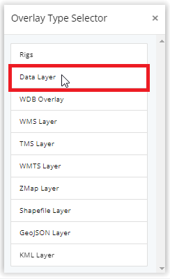
Then choose Data Layer:
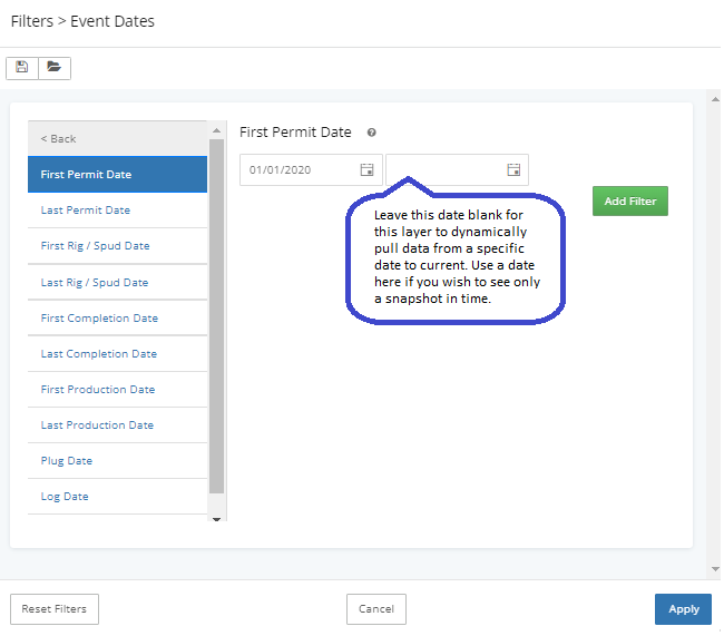
Determine what type of data you want the heat map to represent, and name the layer. For this example, we will create a heat map that represents wells permitted for the first time from 2020-Current.
We will need to edit the filters, and the visualization types.
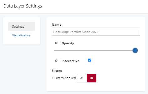
Data Layer Applied Filters:
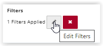
To begin click the pencil to start editing filters:
Navigate to Event Dates> First Permit Date> Enter the Date > Apply
Note: In this example, we are focusing specifically on wells that received their first permit since 2020, which is why we applied the First Permit Date filter. If your goal is to view all permits issued from 2020 to the present, you should use the Last Permit Date filter.
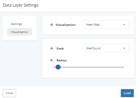
Visualization Type
Next will change the visualization type to heat map.
By using a heat map as a data layer, you can directly see which wells have had the highest permit activity since 2020.
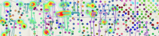
In addition, you can limit the heat map data layer to only show permits for a specific operator, level of production, or any other filter used to limit results.