The WellDatabase map provides quick access and visualization of millions of wells. The map is built on the Google maps platform and therefore provides a familiar and intuitive interface.
The cluster sizes and color break down like below:
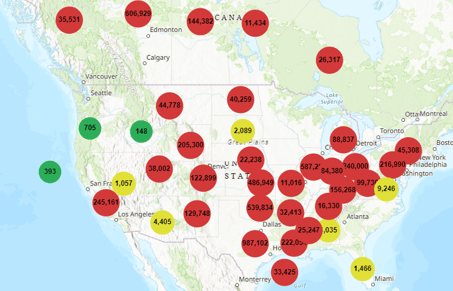
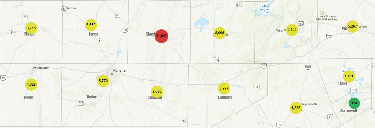
Well clusters appear any time there are more the 50,000 wells on the map. Wells are clustered at the three different levels:
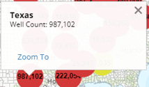
State Level
The initial clusters are grouped at the state level. Clicking on any cluster will give you the state name and the number of wells with location data within that state.
Applying filters will reduce the number of wells accordingly, but the clusters will remain unless the well count is less that 50,000.
Using the "Zoom To" will take you directly to this state. However, the well spots will still be clustered.
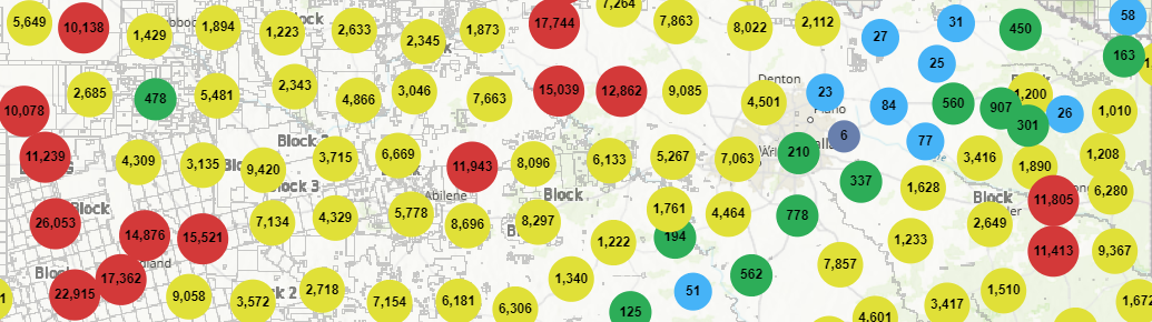
County Level
As you start to zoom in, the clusters break down by county. Just like with the states, you can click on any of the clusters and see the name of the county and the number of wells. You can add the county outlines via the map tools section to better visualize the county breakdown.
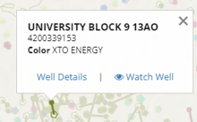
Well Spots
When your search or zoom level on the map reduces the number of wells to under 50,000, well spots will appear on the map. The WellDatabase well spots are based on an enhanced version of the standard oil & gas well spot indicators.
If you click on any of the wells, it will give you the well name, API, and a link to the well details.