How do I create property grid maps?
Grid maps are perfect for visualizing large trends and identifying hotspots. Here's how to use them.
There are a ton of ways to customize your map in WellDatabase. One of the most popular is the use a grid map to show trends or hotspots for a particular property. You can do this either using your primary well layer or by generating a new Data Layer. The latter of which is useful for viewing a property as more of a background behind your wells. We'll run through how to do both options here.
Primary Well Layer
Changing the primary layer to show the grid map instead of well spots is extremely easy. Ideally, the first step is to whittle down your search criteria to ensure consistency in the data. This is relevant here specifically because the grid map will color the grid using a scale based on the value range in your search. That means that if you're mixing verticals and horizontals, and mapping a production volume, then your map might not give you exactly what you're looking for.
For our sample, we'll start with all Eagle Ford wells. Here is what that looks like.
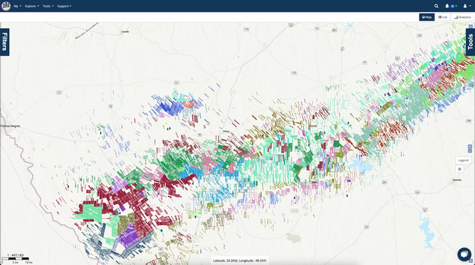
Changing the primary layer type is very straight-forward. First we open the Tools panel on the right hand side of the map. That pan has a Well Layer section and the first option is the Visualization Type. We'll drop down that menu and select Grid Map from the list.

Here is a quick rundown of what the options are:
- Aggregate - How you want the property to be aggregated within the grid. Options here include Sum, Average, P10, P50, P90, and more. We'll be using a simple Average in this example.
- Field - What property value do you want to aggregate. There are hundreds of values to choose from here. For this example, we are choosing Twenty Year EUR Oil.
- Bin Size (miles) - How big you want each grid cell to be. Keep in mind that 1-2 mile laterals means your grid should have a minimum of that size or your averages won't exactly make as much sense. I find that a 5 mile bin is a good start.
- Gradient Colors - By default the scale will use the min and max available values. You can override these here by entering specific values. This can be useful when trying to highlight a particular range of values when the spread of values is too large. Another place where GOR properties are affected.
We'll then set the Aggregate to Average and chose our property to grid by. In this case, we're using the Twenty Year EUR Oil property. We'll also leave the bin size and color as the defaults for this map.

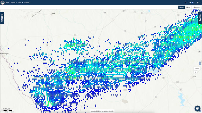
And that's all we need to do in order to get the map below. By default, our grid size is 1 mile. At a high level, this gives a very good idea of the oil hotspots in the play.
Secondary Data Layer
One of the most common uses of the grid map is using it as a background for your well search, Here's the steps to do that.
We're starting over here, so we'll go back to our base Eagle Ford map we created in the beginning.

The first thing we need to do is open up the Tools tab. From there we can click the + button to add a new layer.

The Overlay Type Selector will appear with all of our supported layer types (To learn more about map layers, see our blog on map layers). Here we will select the Data Layer option.
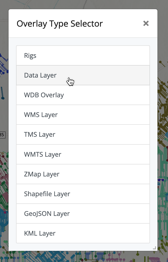
The Data Layer Settings will appear where we can set all of the properties to create the grid map we're looking for. I recommend that the first thing you do is to give the layer a name. This is very helpful once you start adding multiple layers. Here we'll just give it the name "20 Year EUR Oil".
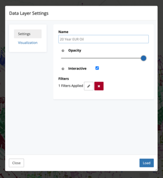
The next step is optional, but recommended. We're going to apply filters for our background layer here. You can do so by clicking on the pencil icon under Filters.

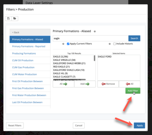
For our purposes, we'll just choose Eagle Ford for the Primary Formation - Aliased. These filters work just like any other, but be sure to click the green Add Filter button. Once you have added all of your filters, then click the Apply button.
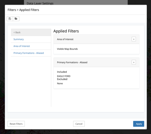
At that point, you'll be able to see all Applied Filters and verify that your selections were applied. Click the Apply button once more to finish with the filters and get back to the Data Layer Settings.
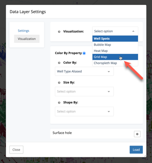
The next (and last real step) thing to do is click the Visualization menu on the left to pick how you want to visualize this layer. Since we are aiming to create a Grid Map, that is what we will select for the Visualization.
From here, we can set a few options for grid map. We discussed them earlier, but here they are again for reference:
- Aggregate - How you want the property to be aggregated within the grid. Options here include Sum, Average, P10, P50, P90, and more. We'll be using a simple Average in this example.
- Field - What property value do you want to aggregate. There are hundreds of values to choose from here. For this example, we are choosing Twenty Year EUR Oil.
- Bin Size (miles) - How big you want each grid cell to be. Keep in mind that 1-2 mile laterals means your grid should have a minimum of that size or your averages won't exactly make as much sense. I find that a 5 mile bin is a good start.
- Gradient Colors - By default the scale will use the min and max available values. You can override these here by entering specific values. This can be useful when trying to highlight a particular range of values when the spread of values is too large. Another place where GOR properties are affected.

Once we click Load, the dialog fades away and we're presented with the following map.
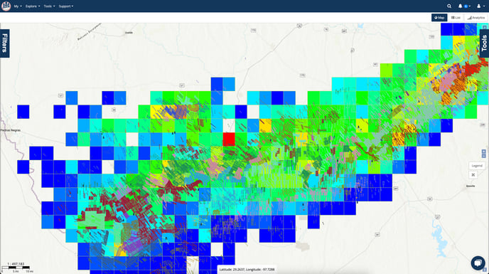
We can see that the well spots are still here, and colored by operator. Behind it is the grid map we're looking for though.
Creating multi-layered maps is a great way to help visualize trends over and area. Additionally, you can combine multiple grid maps with varying opacities for even more in-depth analysis.