To begin, you'll want to visualize the well spots categorized by operator. Start by accessing the tools panel located on the right side of your map. Make sure to select "well spots" as your visualization type, and then proceed to choose the option to color the spots by operator.

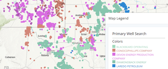
Operators are too close to visually compare:
On occasion the system generated colors for two operators are similar making it difficult to visually differentiate between them.
In the example below, the two companies Blackbeard Operating and Diamondback Energy are too similar to compare on the map.
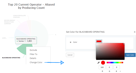
To change the colors on one or more operators, move over to the analytics tab and group by the same option you have the map colored by.
In this example, we have selected "Current Operator - Aliased" for coloring the map, so it is important to group the analytics using the same data point for consistency.

To modify the color for a specific operator, simply click on the pie piece representing the company you wish to change, and then choose the "change color" option from the dropdown menu.
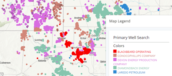
Now, Blackbeard Operating and Diamondback Energy are easy to differentiate between.
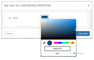
Operator Company Colors:
There may also be times that you want to represent the operators on your map with the company approved colors. You can use the company hex code in the color drop down instead of the RGB.
Explore other articles by searching the topics on the left or if you have any questions feel free to email support@welldatabase.com